Company Overview & Sections By Level Dragon Widget Updates
We are excited to present these widget updates. These features are completed and will be going live in the next couple of weeks. Details on the upgrades and how to configure them are below.
Company Overview Widget Updates
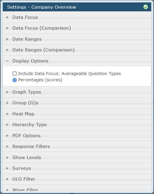
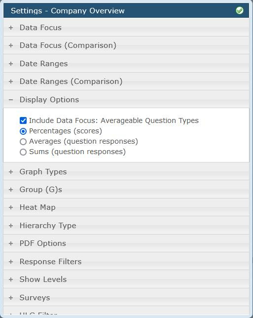
The Display Options settings now include a checkbox for the widget to accommodate Averageable question types (Number, Currency, Measurement and Time Length).
When clicked, the setting will refresh with 2 additional radio options for Averages and Sums.
Also when clicked, the Question List will refresh to now show Averageable Questions (when a specific survey is selected for the widget and Sections/Questions are available)
Percentages is the old method for Overall, Section and Question Scores.
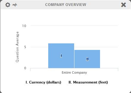
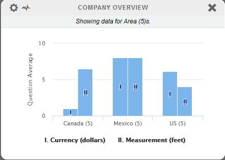
Average is for Number, Currency, Measurement and Time Length and shows an average value for the data, i.e. what was the average amount of money shoppers spent to complete the shop?
Sums is for Number, Currency, Measurement and Time Length and shows the sum for the data, i.e. what was the total amount of money shoppers spent to complete the shop?
The option for comparison data, in grouped bars, still works for these new settings. However, since we cannot display unlike data types in the same graph, some options may not be available at the same time. This means you can’t show, for instance, Overall Score AND Question Sum at the same time. The radio option will say which one to draw and the other graph will have no data. You can do two different Question averages or two different Question sums, etc.
Note – Heatmapping is disabled for Averageable Questions.
Also note – Scored Number Questions are the only question type that will work for Percentage, Average and Sum.
Sections By Level Widget Updates
Next, we’ve made a modification to the “Sections By Level” widget. Now the Display Options include the in-widget filter, previously seen on the Trending – Sections widget.
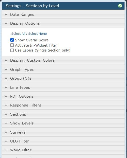
This checkbox will modify the widget for users to be adjustable on the fly without needing to alter the actual settings of the widget. Perfect for shared views.
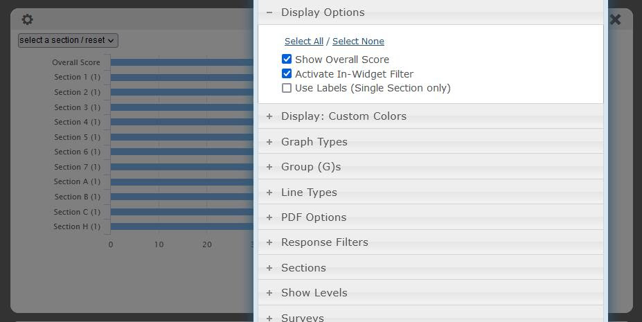
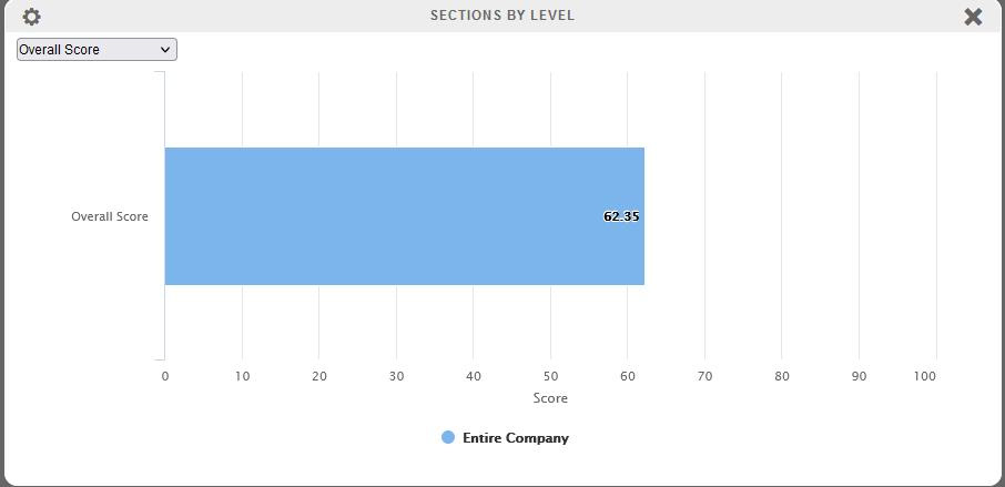
The widget will start in the default state which is to show Overall Score, Major and Minor Sections (depending on configuration to show these things) and allow the user to select a single point of data to display instead of the entire list. One improvement with this widget over the Trending – Sections widget is that the user’s selection will now print to PDF.
The entire list can be restored with the ‘Select a Section/Reset’ at the top of the pulldown.
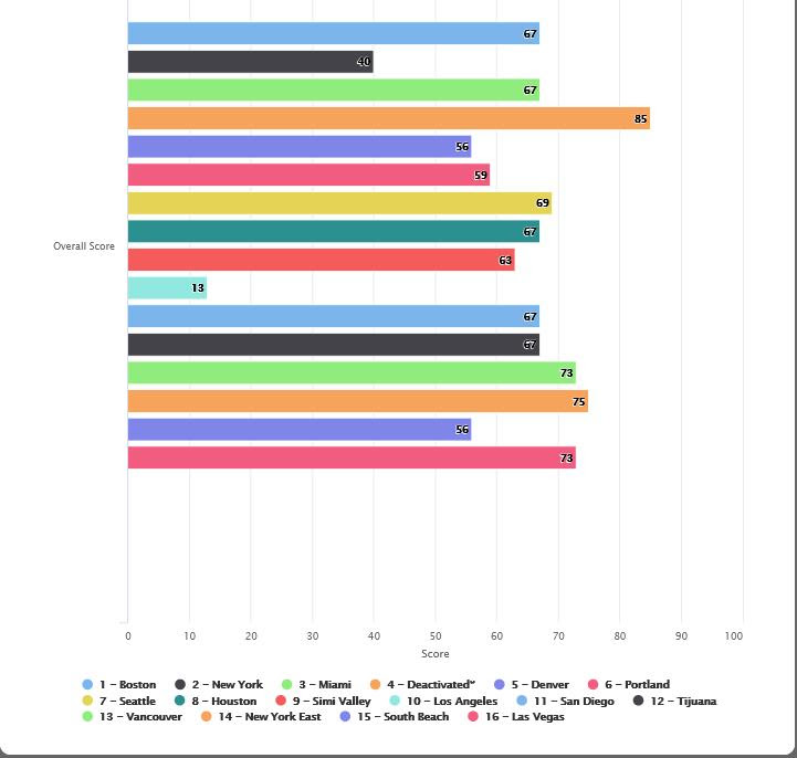
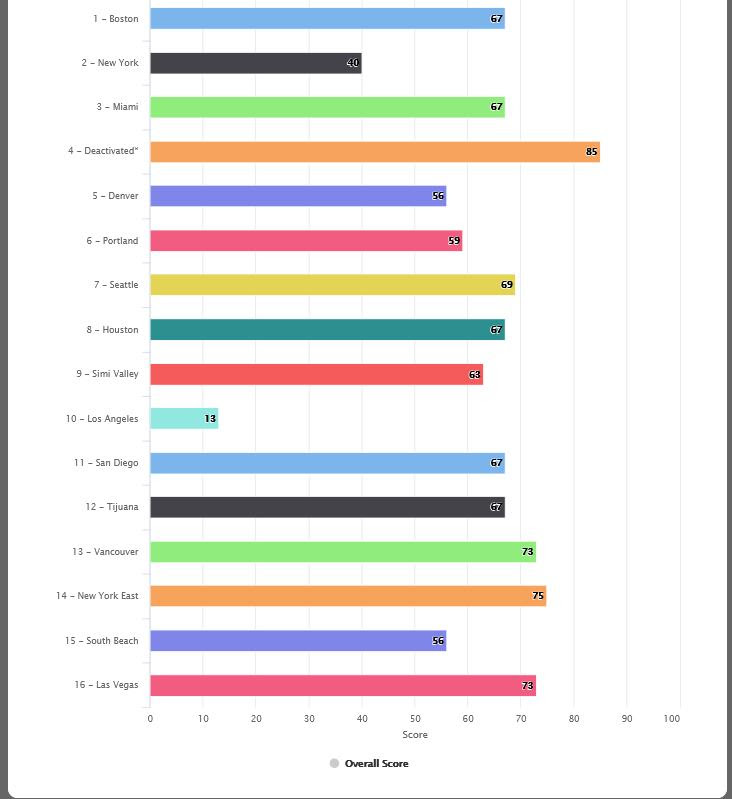
The second part of the In-Widget Filter is the checkbox for the ‘Use Labels’ which flips the X axis labels and the Key. Since the Sections By Level widget is a full-sized widget, it can expand to whatever height is needed which makes a cluttered key considerably easier to read when this setting is used.
This is what it looks like without the setting:
This is what it looks like with the setting:
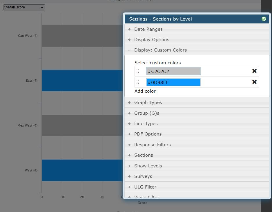
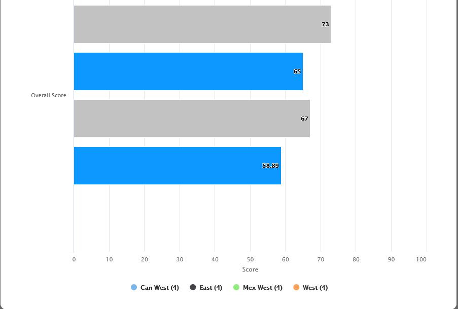
We also added in Display: Custom Colors to this widget that lets the user define specific colors to use for the bars (custom colors do NOT apply to the Key coloring so it pairs better with the In Widget Filter and the Use Labels settings but is not limited to using these). If a single color is defined, all the bars will be that color. If two colors are defined, all the bars will alternate between those two colors. If three colors are defined, three will alternate and so on.
Here is an example of the Key not coloring:
If you have any questions about how to configure the new settings, please feel free to open a tracker notice. Thank you!