Dragon Dashboard updates
New widget: Trending – Responses
New graphing options for assigning colors
New settings for the Key Question widget
New settings for the Drill Down Ranking widget
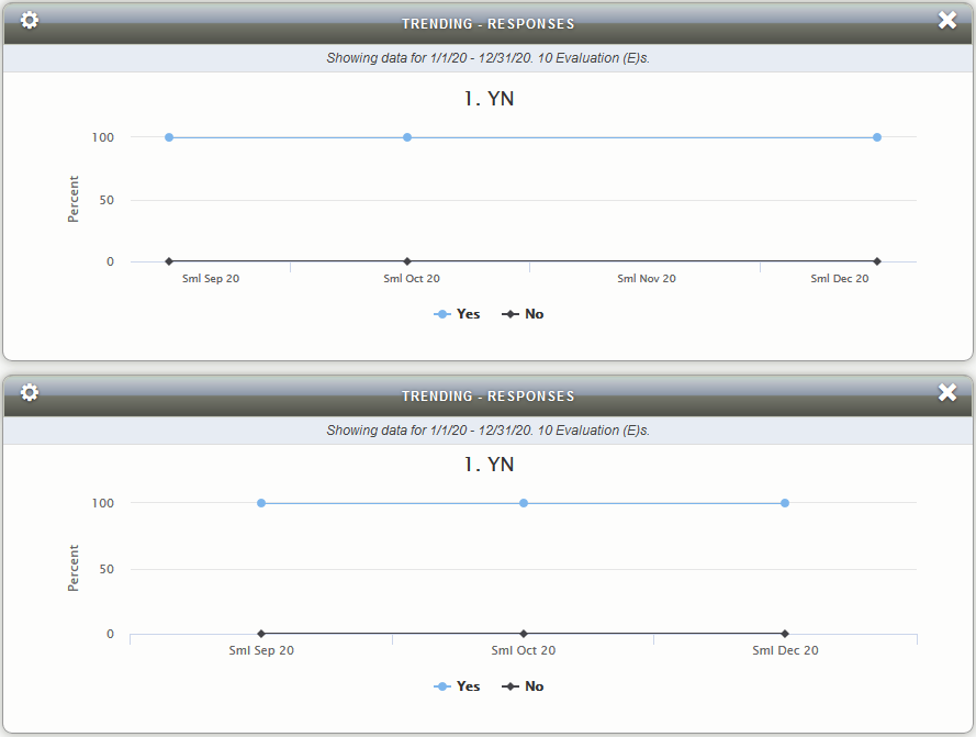
New Widget: Trending – Responses
Graph responses over time as a line graph, bar graph, stacked bar or even table format. Select which answer options are displayed. Group answer options to show or hide.
Line, Bar and Table display view types
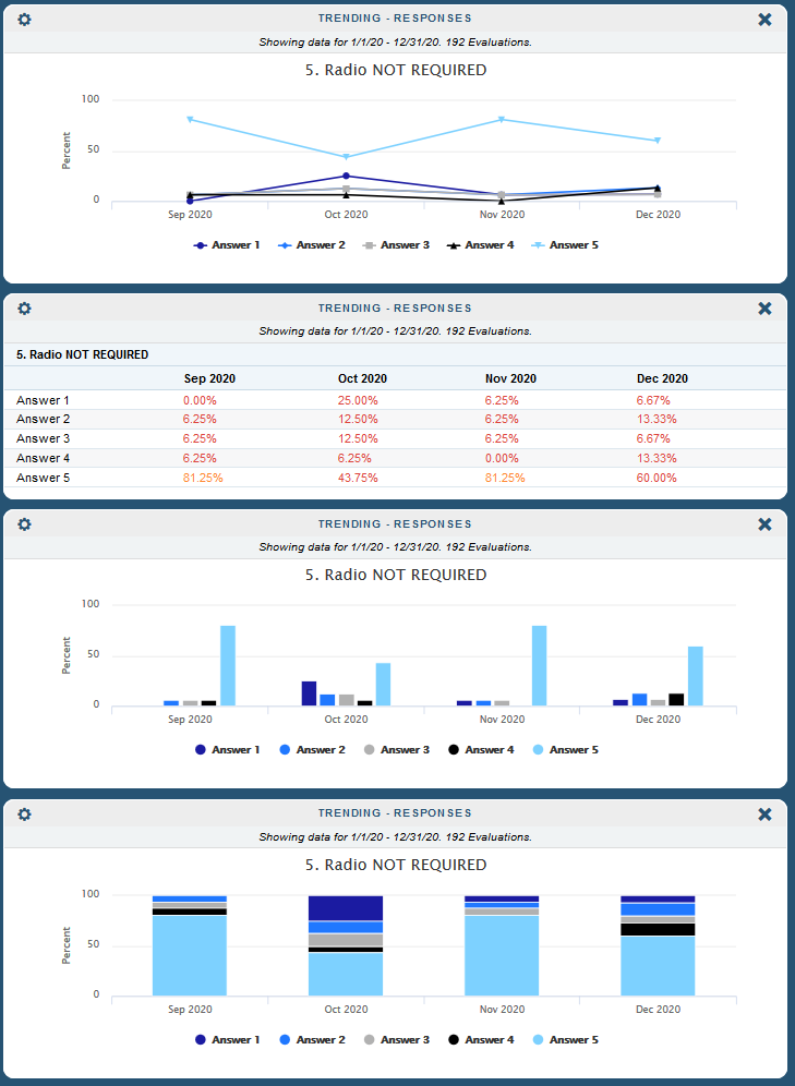
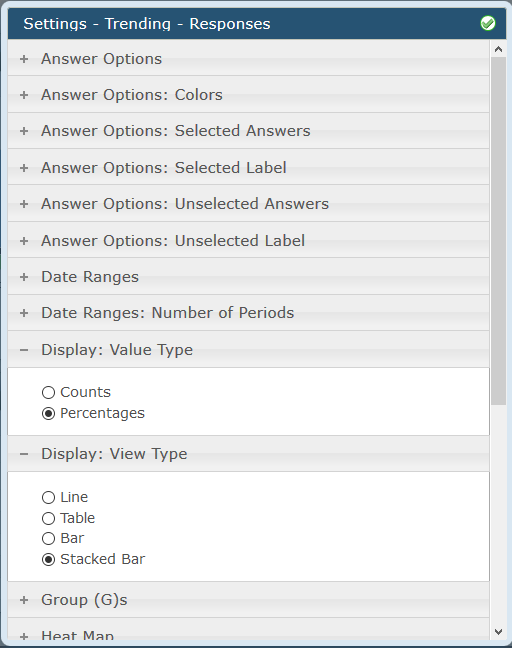
Select Display Value Type and Display View Type
- Display Value Type: Counts or Percentages
- Display View Type: Line, Bar, Stacked Bar or even a table option!
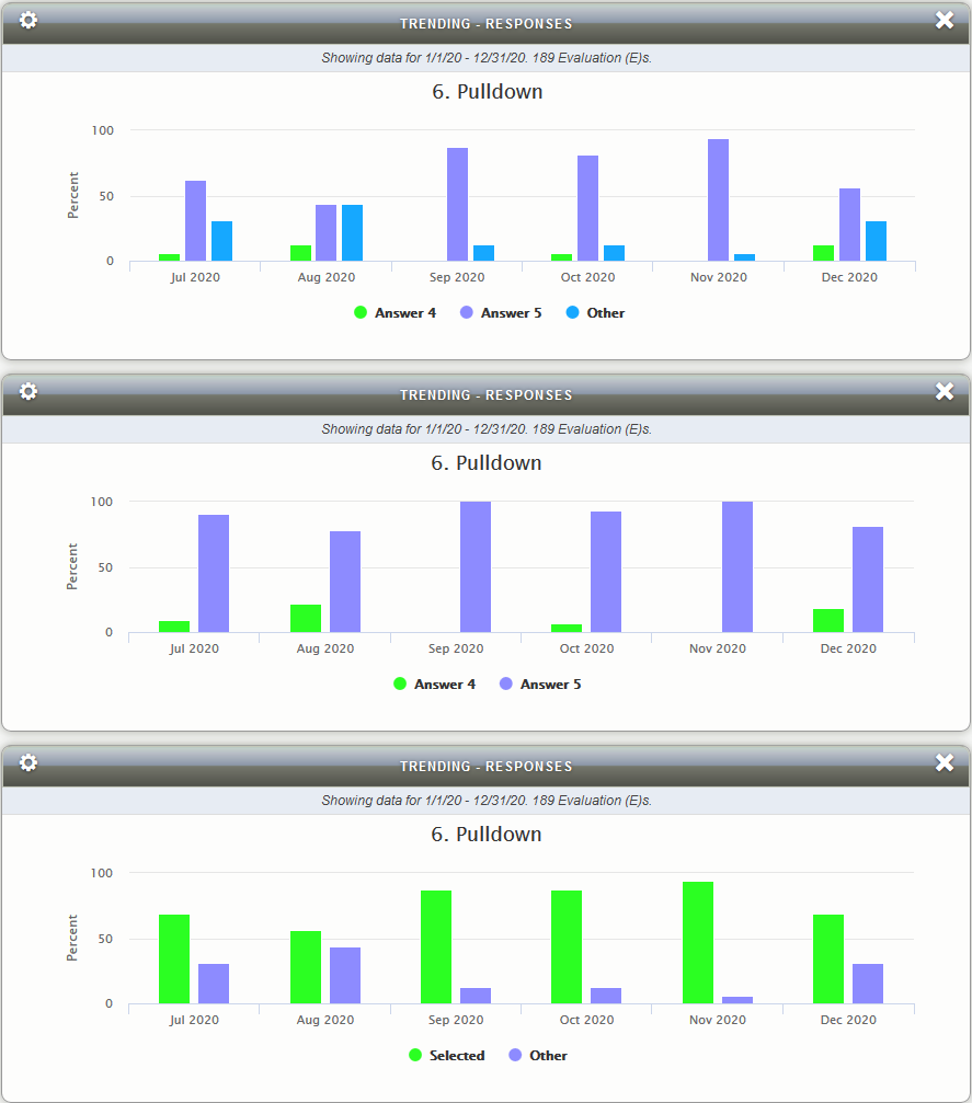
Bar display view type
In the top graph below we are using the ‘Other’ group to only display two answers and Other. All three ‘answers’ will total 100% for a multiple choice question.
In the middle graph we removed answers 1-3 again but this time we are not showing Other. This time the percents are recalculated between the two visible answers to total 100%.
In the bottom graph we are making use of the ‘Selected’ and ‘Other’ groups, each of which contain multiple answers. Again, the two groups will total 100%.
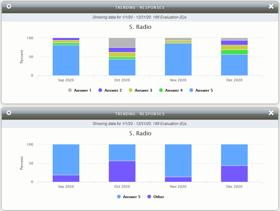
Stacked Bar display view type
The two graphs below show the same data. The top graph is showing all answers and the bottom graph shows options 1-4 combined into ‘Other’ and 5 displayed individually.
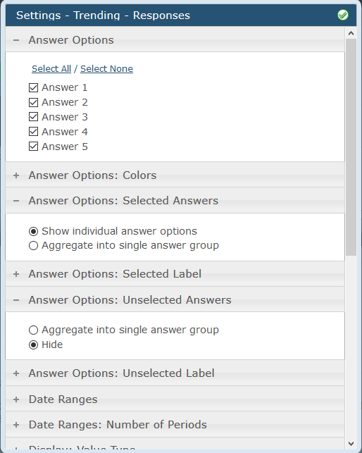
Select which answers to display
- Selected answers can be shown individually or grouped together as a single group.
- Unselected answers can be hidden or also grouped together as a single group.
- The answer group labels ‘Selected’ and ‘Other’ can be renamed using the Answer Options: Selected Label and Answer Options: Unselected Label settings respectively.
Custom Date Range Options
- Custom Date Range Types: Small, Medium, Large (default names – they can be renamed in Client and Form settings).
- Custom Date Range Axis Types: Discrete Categories, Continuous Timeline.
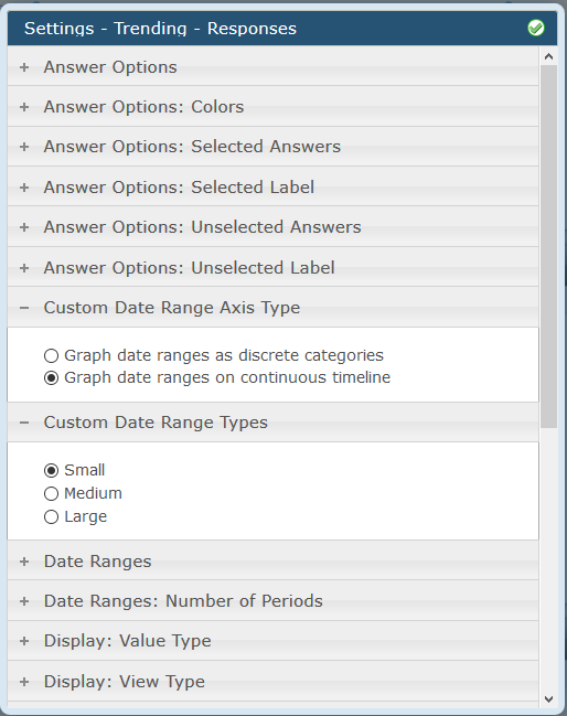
- Continuous will plot the Custom Date Ranges defined by the client regardless of whether shops exist in those periods or not.
- Discrete Categories will show only the Custom Date Ranges that have data in them (meaning no gaps in the timeline)
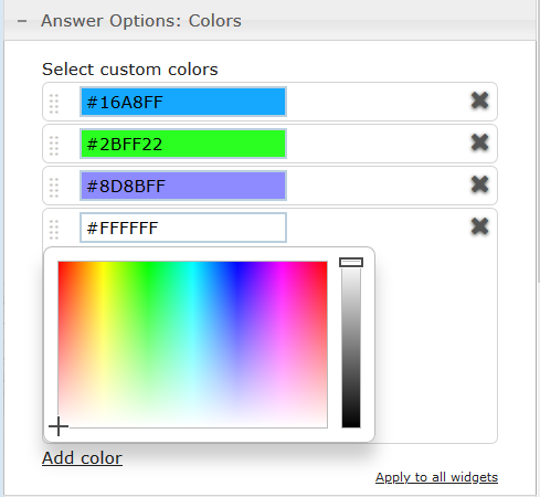
New Graphing options for assigning colors
Custom colors assigned to Question Responses in Graphs
- Manually type in values or click the field to expand the Color Picker.
- Use the grab handle on the left of each entry to drag and drop the order of the colors.
- Color scheme can be applied to all applicable widgets (currently Key Question and Trending – Responses) via the ‘Apply to all’ link on the bottom right.
New settings for the Key Question widget
The Key Question widget now allows for the grouping and / or omission of selected answer options. It can now also be rendered ‘full width’ for when there is a large number of answer options.
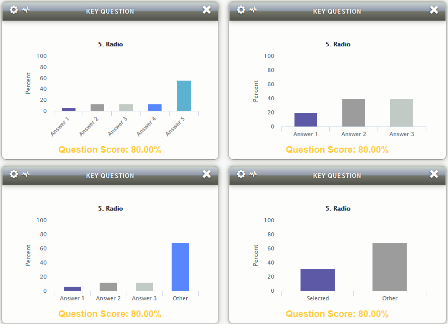
Key Question widget bar graph with new options
- The four graphs below show the same data.
- The top left graph shows all answer options.
- The top right graph shows just answer options 1-3.
- The bottom left graph shows options 1-3 with ‘Other’.
- The bottom right graph shows ‘Selected’ with ‘Other’.
- You can see the Question Score never changes but the bars and their percentages will change depending on how the data is displayed.
- The Score is in yellow based on the Heat Mapping setting.
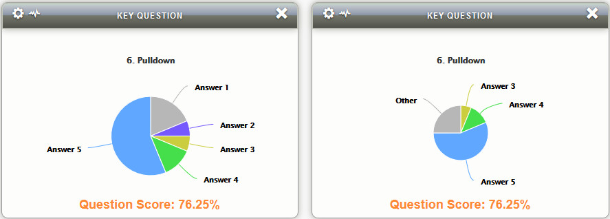
Key Question Pie chart with new options
The graph below on the left shows a pulldown question displaying all answers.
The graph below on the right shows answer options 1 and 2 combined into ‘Other’ and 3-5 are displayed individually.
The Score is in orange based on the Heat Mapping setting.
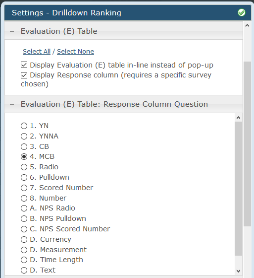
New settings for the Drill Down Ranking widget
Two new display options:
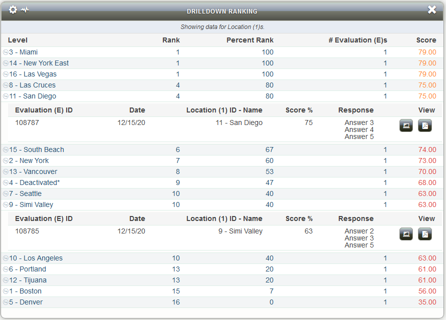
- Evaluation Table: setting to allow the Evaluation Table to be displayed either in a Popup (prior behavior) or now Inline (new). The Evaluation Table appears when you drill down to a Location and then click on that Location.
- Evaluation Table: Response Column Question: an option to show a Questions’ Response in a new column on the Evaluation Table.
We hope your clients enjoy these updates. If you have any questions, please submit a Support Tracker and we will be happy to help.